Here Are Some Data Visualizations That Make Absolutely No Sense
Sep 03, 2013 18:56
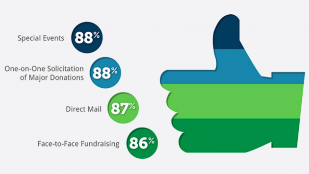
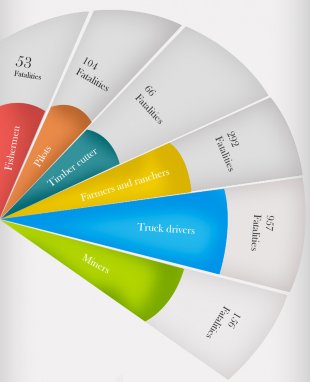
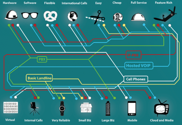
It's always great to put numbers into some visuals, but what happens when they don't make sense? WTF Visualizations have been curating a collection of infographic excerpts that kind of explain next to nothing. They're beautiful no doubt, but it may just not mean that much to anyone who looks at it. Check out some of them below:
Managing inventory efficiently is one of the biggest hurdles when running a manufacturing company. As you start receiving more orders and expanding into new markets, manually keeping track of stock levels can become impossible. Businesses may struggle to operate effectively by trying to adjust inventory levels manually without a clear understanding of what is available. Read more
In today's fast-paced world, the role of pharmaceutical services has become more critical than ever. As healthcare dynamics evolve, the demand for accuracy, efficiency, and safety in this sector soars. It is within this context that the quality of equipment used in pharmacies comes under intense scrutiny. The significance of high-caliber pharmacy medical supplies cannot be understated, as they are instrumental in enabling pharmacists to provide top-tier medical services. Read more
Office efficiency is crucial for success and competitiveness, whether you're a small company or a major corporation. This comprehensive reference provides tactics, tips, and tools to boost workplace productivity. Read more