


Top 5 Band Logos with Their Meaning Explained
Jun 25, 2019 20:42
What if a great logo comes from a less-known band? What if a classic band has a weak logo? These are the two problems you encounter while making a ranking similar to the one you see on this page.
We’ve tried to take into consideration both the factors. While the Beatles, for instance, are often referred to as the most popular band of all time, their logo hasn’t been mentioned in this list. Even the band’s fame can’t make us to this.
From the other hand, we could have speculated whether the Rolling Stones logo would have been our #1 if it had belonged to an obscure band… But why on earth would we be so cruel as to even pose this question?
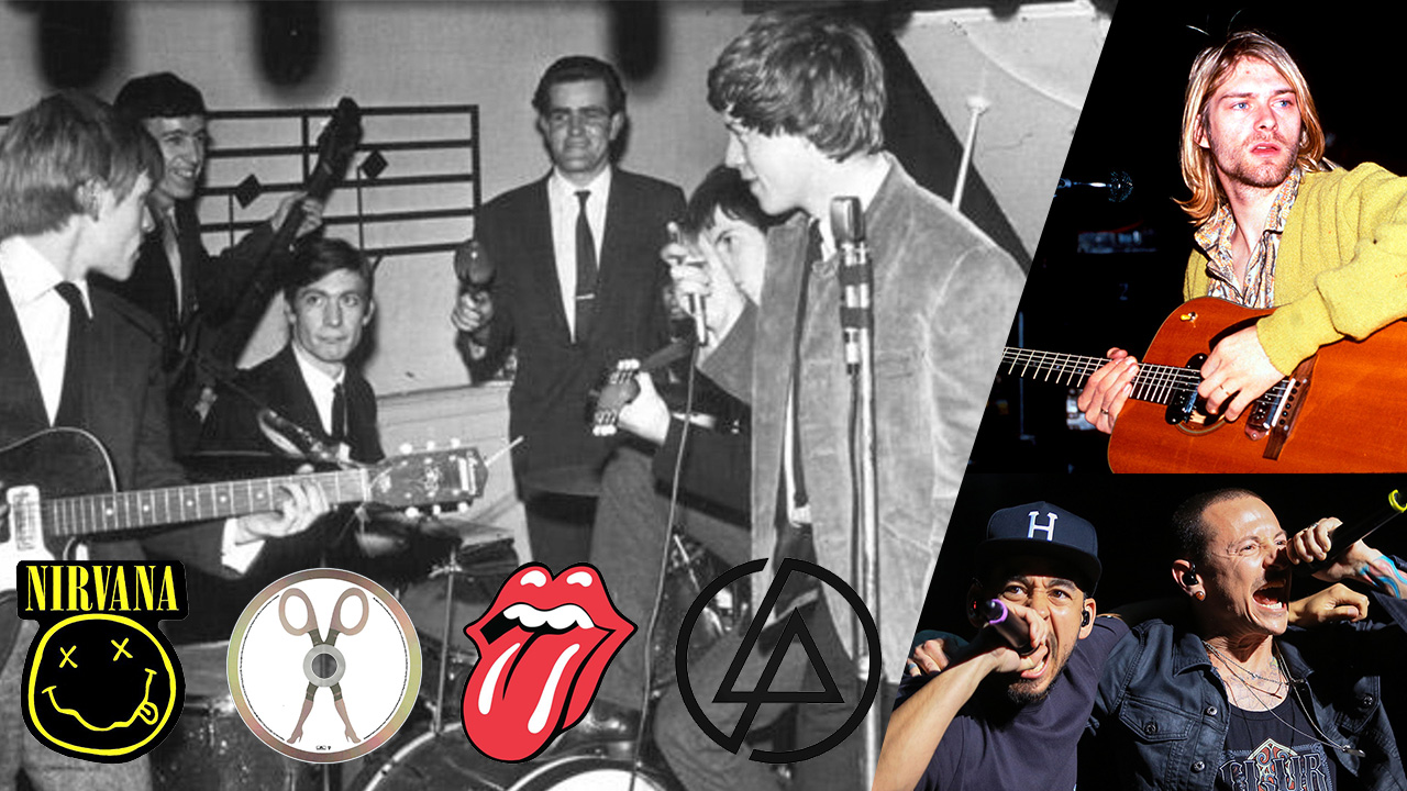
1. Rolling Stones
We’ve chosen this one for the clear link it creates with the band. And also, because it’s memorable and emotionally charged. It turns heads and may cheer you up like a cup of coffee in the morning.
The tongue design, which perpetuated Mick Jagger's mouth, was created by pop-artist John Pasche in 1970. It made its debut on the cover of the Sticky Fingers album. Pasche, who was a design student back then, said he was paid £50 for the logo in 1970 and £200 more two years later. By the way, in addition to Mick Jagger’s lips, the image was also inspired by the Hindu goddess Kali.
2. Linkin Park
While the band has gone through about ten emblems since its inception in 1997, here, we’re talking about the one featuring interlacing “L” and “P” formed by a single line. It was introduced on the cover of the Minutes to Midnight album. What makes this one stand out is that the shape formed by the letters is memorable and intriguing in itself. It looks like an ancient symbol of some sort.
The band has experimented with the outline, which has been an open ring, a double ring (both open), and a hexagon. Also, the logo without the outline was introduced in 2014.
Following the death of Chester Bennington, who had been performing with the band for almost 20 years, Linking Park unveiled a hexagon logo with one open end.
3. Nirvana
Nirvana introduced the “Smiley Face” logo in 1991, four years after the band was created. Originally, it wasn’t an official logo - it was printed on the flyer for the launch party for the Nevermind album. Soon, the crossed-out eyes and drooling mouth became the symbol of the band.
While Nirvana has never commented on the meaning, the most popular explanation is that the face shows the expression fans had during performances. You can find out other possible versions in the article about Nirvana on the website dedicated to famous company logos.
4. Scissor Sisters
While the band is less popular than the ones mentioned above, its logo is eye-catching and highly memorable in itself. Moreover, it creates a powerful link with the band’s name. The emblem was developed by the guitarist Scott Hoffman in 2001, the following day after Jake Shears, the frontman, introduced the name Scissor Sisters. Both the name and the logo have raised and will raise many eyebrows.
5. The Offspring
The logo was designed by Alan Forbes, a San Francisco-based poster artist and painter. It was introduced on the cover of the Conspiracy Of One album in 2000. The image is emotionally charged and rather recognizable, partly due to the burning snake-like hair.
Other impressive music logos include Metallica, Prince, The Doors, Radiohead, Bauhaus, Motorhead, and Ween, to name just a few.