
























































Game of Thrones Season 3 Explained Through Charts
May 08, 2014 19:38
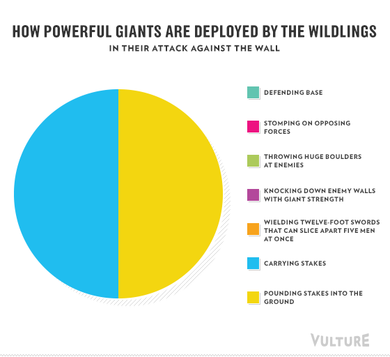
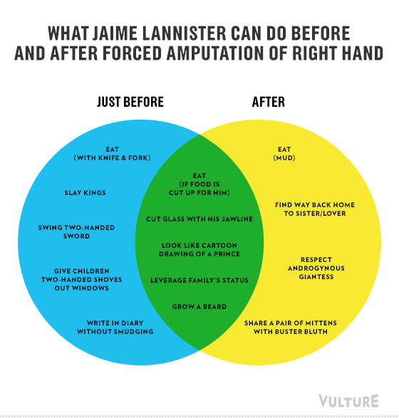
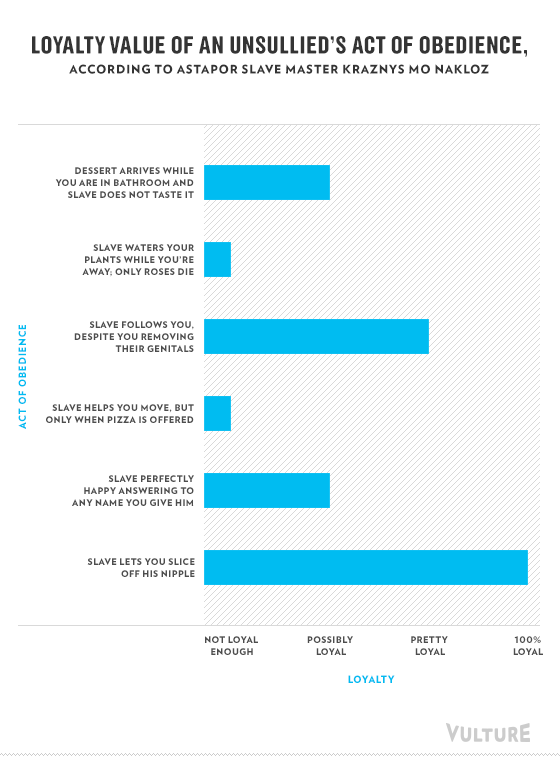
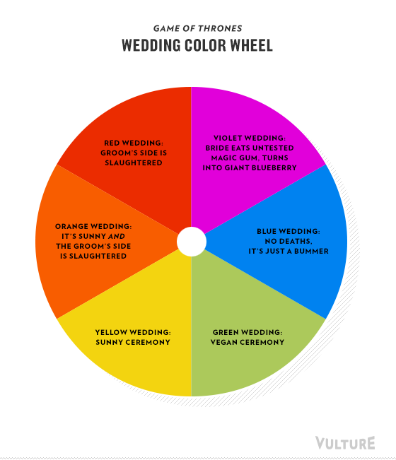
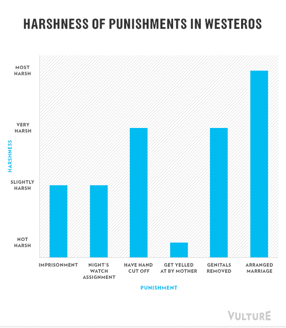
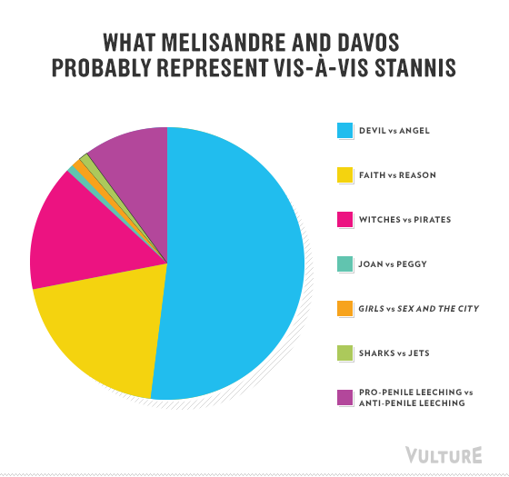
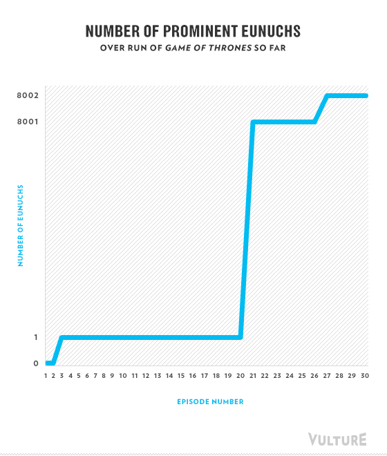
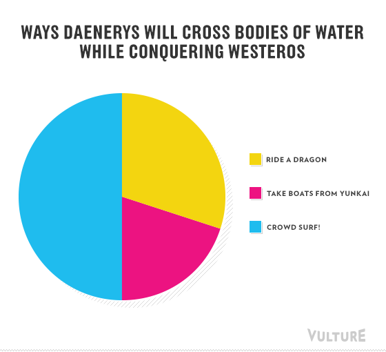
So this is what to expect if your office decided to conduct a meeting to analyze Game of Thrones. Posted by Vulture, these hysterical infographics offer a new look at all the episodes from season 3.