


15 Imitation Brands That Suck So Bad You'll Actually Feel Sorry For Them
May 05, 2014 22:22
Imitation is the sincerest form of flattery. That's what they say.
But sometimes, imitators try so hard that they end up being a laughing
stock instead of being masters of disguise.
Here are some really atrocious attempts at being similar to the original brand, albeit the use of similar lettering and symbols to try and trick the eye into thinking it's the original. It works for a second, until you spot the errors:
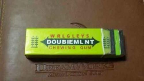
1. This would totally work if you were dyslexic.
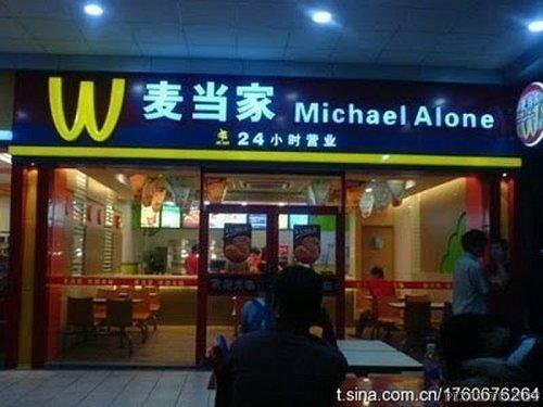
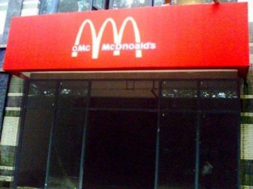
2. WcDonalds might have been better
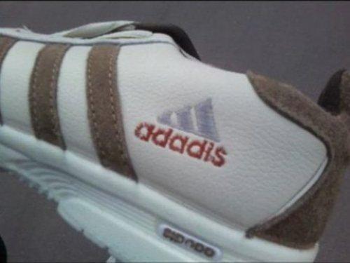
3. If the logo print was smaller, nobody would notice!
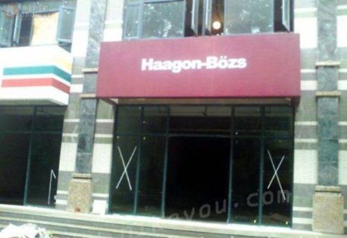
4. My favorite ice cream! Haagon-Bozs!
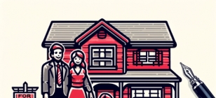
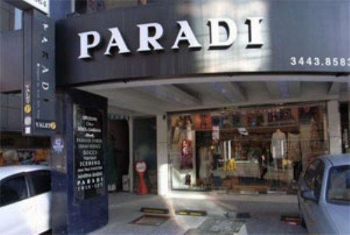
5. Here's an affordable designer brand.
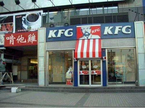
6. Kentucky Fried G-ken's Colonel looks much younger..
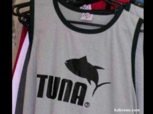
7. Well at least they used a pouncing animal..
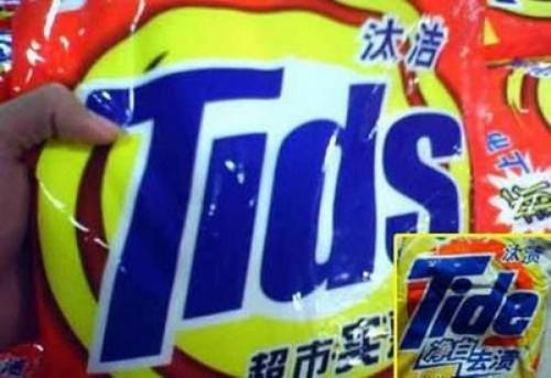
8. MMMM this would totally work if you were dyslexic and stuttering.
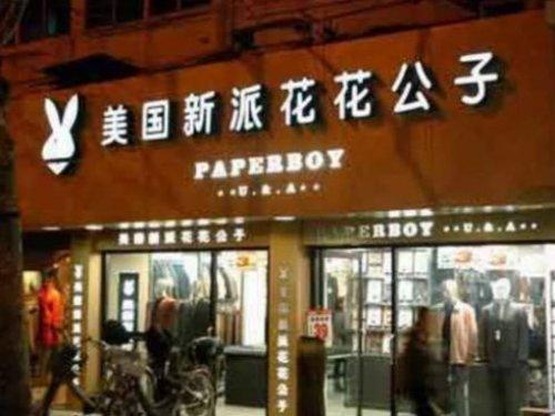
9. Can't stop thinking of what Paperboy bunnies would look like.
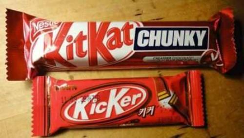
10. Have a break, just Kick 'er.
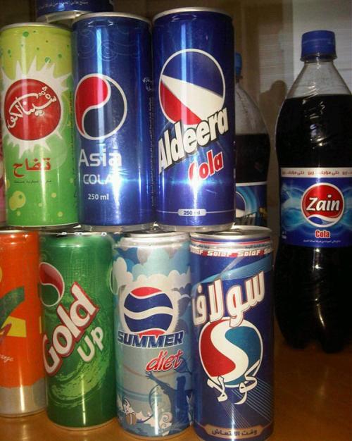
11. That moment when you realize you have no idea where you are or what you're eating.
12. Not even close!
13. Only the best..
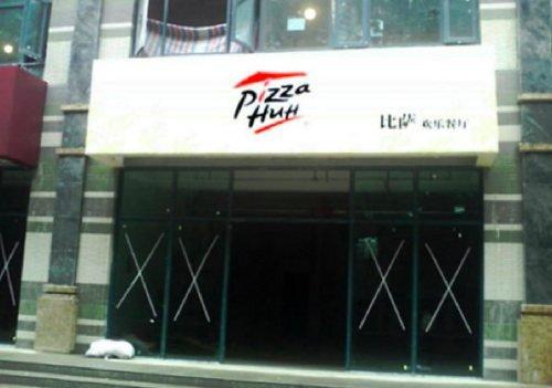
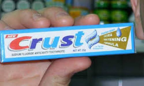
14. Let's get some crust onto your teeth, shall we?
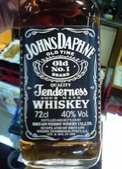
15. Let me just.. JohnsDaphne, quality Tenderness... SCOTLAND OF BRITAIN......... I can't. This is excruciating.
Here are some really atrocious attempts at being similar to the original brand, albeit the use of similar lettering and symbols to try and trick the eye into thinking it's the original. It works for a second, until you spot the errors:
1. This would totally work if you were dyslexic.
2. WcDonalds might have been better
3. If the logo print was smaller, nobody would notice!
4. My favorite ice cream! Haagon-Bozs!
5. Here's an affordable designer brand.
6. Kentucky Fried G-ken's Colonel looks much younger..
7. Well at least they used a pouncing animal..
8. MMMM this would totally work if you were dyslexic and stuttering.
9. Can't stop thinking of what Paperboy bunnies would look like.
10. Have a break, just Kick 'er.
11. That moment when you realize you have no idea where you are or what you're eating.
12. Not even close!
13. Only the best..
14. Let's get some crust onto your teeth, shall we?
15. Let me just.. JohnsDaphne, quality Tenderness... SCOTLAND OF BRITAIN......... I can't. This is excruciating.