


The Style Spectrum: A Look at the Impact of Colour in Interior Design
Nov 14, 2018 19:36
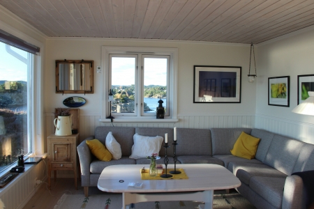
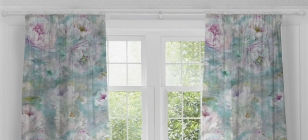
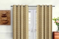
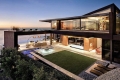
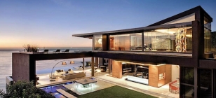
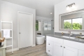
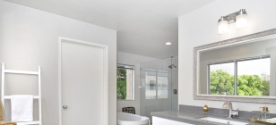
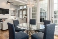
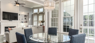
Colour has such a profound ability to impact the mood and the overall vibe of a space, and nothing is truer when applied to interior design. When paired with furniture fixtures and decor elements the colour scheme of your walls has a strong ability to create a whole new look - dependant on what you are wanting to achieve.
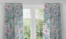
(Image source: www.pixabay.com)
Psychology of colour
You can’t underestimate the power of colour in reflecting emotional undercurrents. Whilst this might sound a bit ‘new age’, it’s actually no secret that advertisers, marketers, visual merchandisers, designers (and plenty of other professionals) work with the colour wheel to create a physical impact to influence and evoke responses. Interior design by Create Expectations is an example of one such company that understands the impact that colour can achieve in bringing new life to a space.
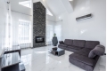
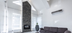
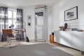
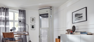
When you step into a home, you can’t help noticing how the interior scheme informs your idea about the occupants - their preferences and what characterises their way of life. It might seem a bit superficial, but there’s no denying that an impression is inevitably formed based on how a room makes you feel; whether it gives off an air of contemporary/cutting edge; eclectic/artsy; romantic/soft, or some other aesthetic milieu. That’s because colour creates a resonance based on symbolism and energy - it is the psychology of colour.
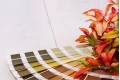
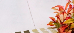
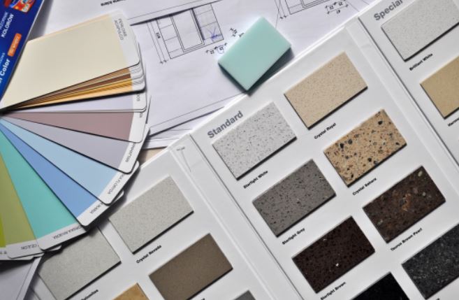
Colour theory
Did you know that colour has its own theory? When you paint your walls it reflects this fact, for example red would be a perfect accent’. It is usually too strong and stimulating to be used for entire walls and is much better put to work in small doses. In particular, dark red is associated with decidedly less-than-calming qualities like rage, willpower, vigour, anger, courage, wrath and even malice.
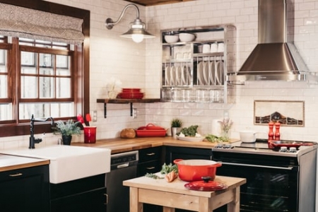
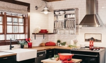
Conversely, at the opposite end of the colour wheel blue represents the hue of the sky and sea. Henceforth, it often correlates to the values of depth, stability, wisdom, faith and truth. Most importantly, the colour light blue can impart a sense of calm and tranquil. Therefore, you might find this colour most fitting in a bedroom. However, do keep it away from the kitchen - experts suggest that the colour blue suppresses appetite so (unless you are on a permanent diet) this may not be the wisest choice for this particular setting.
Colour and design
In the best application of interior decorating, colour and design should work in perfect synchronicity to create a desired effect. Successful approaches invoke the art of matching, contrasting and reflecting colours that are carefully selected to match their most ideal space. This will look pleasing to the eye and create a positive psychological response. Cool and warm tones, complementary and split colour schemes, and even triadic and tetradic systems are the technical preserve of interior design specialists.
Using colour in design is about harmonising with 3D elements in a given space to manifest an all-enveloping experience. Much like music, colour schemes have the power to transcend on an even subliminal level. That’s why it’s best left to the experts to decide the right fit for your style of home. Not only have they worked with a variety of mediums and in a range of vastly different spaces, but the best decorators and designers will understand colour on an intrinsic level - both in theory and in practice.
Colour is fundamental
The impact of colour in interior design goes beyond what can be explained by mere words. It is always a sensory exploration that best serves this topic. What is certain is that there is a colour for any purpose. Whether neutral, clean and minimal, playful, provincial and pastel, or dark, rustic and atmospheric; with the right interior designer, you can achieve the mediums, modes and moods to perfectly match your preferred interior aesthetic.