15 Famous Logos with Hidden Meanings You Never Knew
May 06, 2014 23:00
The success of a brand often relates to its products and the logo
that represents it. Logos play a significant role in consumer
psychology, and some of the most famous brands in the world constantly update their logos to stay relevant.
At a glance, logos for huge brands represent their companies deliberately, and some of them have hidden icons within them. But did you know they also had hidden meanings? Find out what they are below:
1. Amazon

That Amazon arrow looks like a smiley face, and it means Amazon is there to make its customers happy. Also, notice that the arrow is pointing from the a to the z? It represents the fact that Amazon provides a variety of items for sale, literally from A to Z.
2. McDonald's
While, yes, the M really means McDonald's, it also came to mean something unintentionally by customers, according to design consultant and psychologist Louis Cheskin. In the '60s, McDonald's wanted to change their logo but Cheskin insisted on leaving the golden arches. He said it's because customers unconsciously recognize the logo as "symbolism of a pair of nourishing breasts" (via BBC). Whether we unconsciously believe this or not, Cheskin convinced them and now the logo is one of the most recognizable in the world.
3. Apple
The Apple logo has to do with the creation story of Adam and Eve. It represents the forbidden fruit from the "Tree of Knowledge."
4. IBM
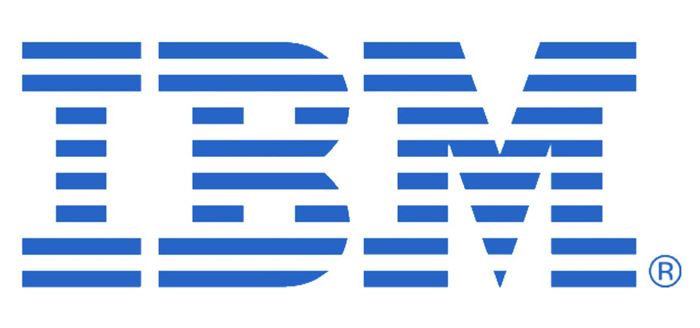
The white lines passing through give the appearance of the equal sign in the lower right corner, representing equality.
5. adidas
adidas' famed three stripes was part of the original logo in 1967 and never really meant anything. It was just supposed to be unique. But in the '90s, they slanted the stripes so that it would create a representation of a mountain, which stands for the obstacles people need to overcome.
6. FedEx
If you look closely between the spaces of the letter 'E' and 'X' you'll notice an arrow. But what does it mean? It represents the company's forward-thinking ways and outlook towards the future!
7. Audi
Those four hoops represent the four founding companies of the Auto-Union Consortium back in 1932, like DKW, Horch, Wanderer and Audi
8. Google
Have you noticed how Google's logo has four primary colors in a row, before it's broken by a secondary color? Well it was entirely intentional. Google wanted to show that they don't play by the rules and are also playful without making the symbol bulky. So they used simple letters and colors for what is now an iconic logo.
9. Mercedes-Benz

The tri-star logo is a representative of the company's dominance in quality and style over all things land, sea and air.
10. NBC
Yes, it's obviously a peacock, but why does it have so many colors? It's because back in the '50s, NBC's owner was RCA, who had just begun to manufacture color televisions. Since RCA wanted people who were still watching black-and-white TVs to know what they were missing, NBC created the colorful logo to adapt to new technology.
11. Volkswagen
Volkswagen's logo is simple but heartwarming. The 'V' and the 'W' can easily be seen. In German, 'Volks' means people, and 'Wagen' means car. So it's the car for the people!
12. Mobil
This logo's importance lies in its colors. The red represents strength, and the blue represents faithfulness and security that the company provides.
13. BMW
Not many people know that BMW has a history in aviation, and that its logo actually stays true to its roots. The blue and white represent a propeller in motion with the sky peeking through. In fact, BMW played a role in World War II as a creator of aircraft engines for the German military.
14. Toyota

The three ellipses in Toyota's logo represent three hearts: the heart of the customer, the heart of the product, and the heart of progress in the field of technology
15. Pepsi
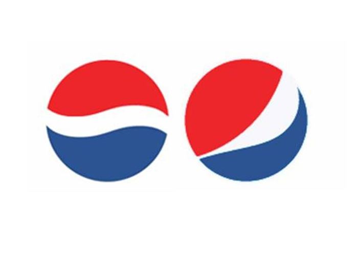
As recent as 2008, Pepsi spent $1 million to pay Arnell Associates to come up with the new logo (the old is the on the left and the new on the right). As a result, Pepsi had to pay millions more to re-brand everything. Then Arnell's document was leaked and it was entitled, "Breathtaking Design Strategy." It suggested that the new logo was some kind of Da Vinci Code. According to Arnell's document, the Pepsi logo draws on Feng shui, the Renaissance, the Earth's Geodynamo, the theory of relativity, the universe, and more. What they're saying is that the Pepsi logo is the key to the universe.
At a glance, logos for huge brands represent their companies deliberately, and some of them have hidden icons within them. But did you know they also had hidden meanings? Find out what they are below:
1. Amazon

That Amazon arrow looks like a smiley face, and it means Amazon is there to make its customers happy. Also, notice that the arrow is pointing from the a to the z? It represents the fact that Amazon provides a variety of items for sale, literally from A to Z.
2. McDonald's

While, yes, the M really means McDonald's, it also came to mean something unintentionally by customers, according to design consultant and psychologist Louis Cheskin. In the '60s, McDonald's wanted to change their logo but Cheskin insisted on leaving the golden arches. He said it's because customers unconsciously recognize the logo as "symbolism of a pair of nourishing breasts" (via BBC). Whether we unconsciously believe this or not, Cheskin convinced them and now the logo is one of the most recognizable in the world.
3. Apple

The Apple logo has to do with the creation story of Adam and Eve. It represents the forbidden fruit from the "Tree of Knowledge."
4. IBM

The white lines passing through give the appearance of the equal sign in the lower right corner, representing equality.
5. adidas

adidas' famed three stripes was part of the original logo in 1967 and never really meant anything. It was just supposed to be unique. But in the '90s, they slanted the stripes so that it would create a representation of a mountain, which stands for the obstacles people need to overcome.
6. FedEx

If you look closely between the spaces of the letter 'E' and 'X' you'll notice an arrow. But what does it mean? It represents the company's forward-thinking ways and outlook towards the future!
7. Audi

Those four hoops represent the four founding companies of the Auto-Union Consortium back in 1932, like DKW, Horch, Wanderer and Audi
8. Google

Have you noticed how Google's logo has four primary colors in a row, before it's broken by a secondary color? Well it was entirely intentional. Google wanted to show that they don't play by the rules and are also playful without making the symbol bulky. So they used simple letters and colors for what is now an iconic logo.
9. Mercedes-Benz

The tri-star logo is a representative of the company's dominance in quality and style over all things land, sea and air.
10. NBC

Yes, it's obviously a peacock, but why does it have so many colors? It's because back in the '50s, NBC's owner was RCA, who had just begun to manufacture color televisions. Since RCA wanted people who were still watching black-and-white TVs to know what they were missing, NBC created the colorful logo to adapt to new technology.
11. Volkswagen

Volkswagen's logo is simple but heartwarming. The 'V' and the 'W' can easily be seen. In German, 'Volks' means people, and 'Wagen' means car. So it's the car for the people!
12. Mobil

This logo's importance lies in its colors. The red represents strength, and the blue represents faithfulness and security that the company provides.
13. BMW

Not many people know that BMW has a history in aviation, and that its logo actually stays true to its roots. The blue and white represent a propeller in motion with the sky peeking through. In fact, BMW played a role in World War II as a creator of aircraft engines for the German military.
14. Toyota

The three ellipses in Toyota's logo represent three hearts: the heart of the customer, the heart of the product, and the heart of progress in the field of technology
15. Pepsi

As recent as 2008, Pepsi spent $1 million to pay Arnell Associates to come up with the new logo (the old is the on the left and the new on the right). As a result, Pepsi had to pay millions more to re-brand everything. Then Arnell's document was leaked and it was entitled, "Breathtaking Design Strategy." It suggested that the new logo was some kind of Da Vinci Code. According to Arnell's document, the Pepsi logo draws on Feng shui, the Renaissance, the Earth's Geodynamo, the theory of relativity, the universe, and more. What they're saying is that the Pepsi logo is the key to the universe.


