Pop Art Makeover for these Oscar-Nominated Movie Posters Are Better Than the Original
Feb 27, 2014 20:12
Shutterstock has asked its design team to mash up its library of stock photos, graphics and illustrations into new original pop-art styled posters for the Academy Award Best Picture contenders. And the result: posters that are better than the original!
You'll most likely prefer Shutterstock's version to the original. Featuring the works of folks like Lily Ou, Jordan Roland, Cristin Burton, Deanna Paquette and more, check them out after the jump:




You'll most likely prefer Shutterstock's version to the original. Featuring the works of folks like Lily Ou, Jordan Roland, Cristin Burton, Deanna Paquette and more, check them out after the jump:
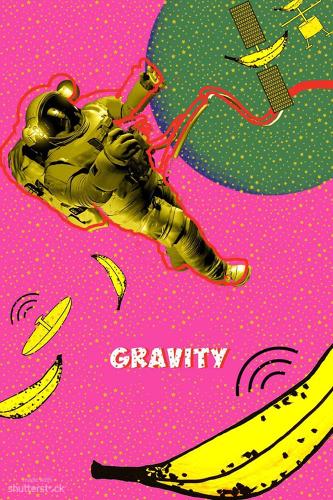
Gravity by Lily Ou
"The idea for my Gravity poster was to take a common Pop Art pattern, but replace the dots with stars to set it in space. To give it a humorous twist, I used bananas as missiles, striking and shattering the satellite, sending the hapless astronaut plummeting away."
The Wolf of Wall Street by Jordan Roland
"For me, Pop Art is as much about the bold, simple message it relays as the visual itself. I chose to show The Wolf Of Wall Street for what it represented in a simple, confronting image. Stylistically, I looked to Robert Dowd and the pieces for which he painted currency with either simple alterations--or none at all."
Nebraska by Cristin Burton
"Playing off of Warhol's and other Pop artists' nod to American consumerism and mass reproduction, this poster features a flat, simple illustration of a motor-oil can, which compliments the flat tone of the movie. While there is no direct reference to motor oil in Nebraska, the plot centers around a Middle-American road trip, a small town, and even a visit to a mechanic's shop by the main characters, Woody (Bruce Dern) and David (Will Forte)."
Her by Deanna Paquette
"Nodding to Allen Jones's obsession with physical relationships, this poster explores sexuality driven by communication. Aesthetically, the colors in Spike Jonze's unconventional love story are both encompassing and crucial to the storytelling. I used Adobe Kuler to help capture the palette directly from the film and bring it into this design to translate the mood."
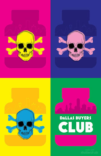
Dallas Buyers Club by Adriana Marin
"The silhouettes of pill bottles with a skull and crossbones represent the ineffective and eventually toxic drugs used during clinical trials for HIV treatment; they're contrasted by neon colors inspired by Jared Leto's vivacious portrayal of Rayon and Matthew McConaughey's equal gusto as Ron Woodroof. The final bottle represents the illegal but live-saving drugs that Woodroof was smuggling in from Mexico, which not only helped many other HIV-positive patients, but also extended his own life by several years."
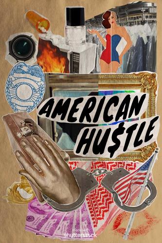
American Hustle by Jami Miles
"Inspired by artist Eduardo Paolozzi's collage style, this poster particularly reflects the aesthetics of his 1948 work 'Dr. Pepper,' as well as his BUNK series, using popular imagery and elements of surrealism. I wanted to sum up the film and its dramatic yet humorous mood by presenting literal and figurative imagery that played into its brilliant narrative, and Paolozzi's collage style felt like the perfect way to pull the visual components together."
12 Years a Slave by Kathy Cho
"I wanted to use vibrant, bold colors in an abstract but simple way, with imagery representing the idea of freedom that is so inherent in this film. When Solomon is abducted and sold into slavery, it's actually his talent at the violin that makes him a target. His music is often an aid during his imprisonment, but the violin and his chains are inextricably linked. The bird represents finally finding freedom after all the hardship and horror."
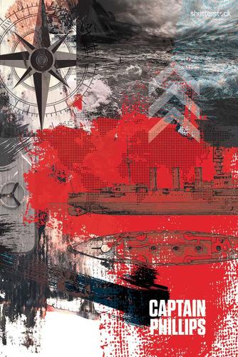
Captain Phillips by Rachael Polack
"Paint, overlays, and scrap imagery come together here to represent the complexity and gripping truth behind the story of Captain Phillips. This poster was created in the style of pop artist Robert Rauschenberg, who was a master of textures, 'combines,' printmaking, sculpture, and more."
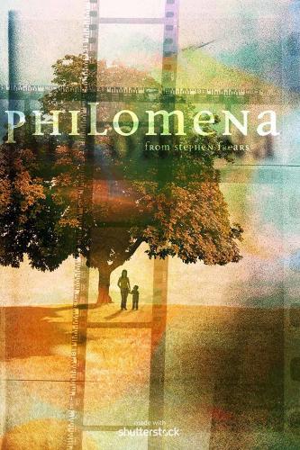
Philomena by Philippe Intraligi
"My spin on Philomena is based on the core aesthetic of the film, which plays with memories in the form of Super 8 snippets. Super 8 cameras were among the first mass-marketed consumer tools for capturing people's lives, and they play into the spirit of Pop Art and readymades. The design of the poster uses film snippets overlapping as a cross, framing the main character and her lost boy. The tree stands for the Tree of Life, playing into the main storyline of the film."