Before Photoshop, film posters were somewhat a piece of art. Remember Jaws, Scarface, or Stanley Kubrick's Clockwork Orange? The first thing that comes to mind upon looking at those posters may not be a scene from the film, but the image of the promotional poster that advertised it.
Have you noticed movie posters of the past decade or so? It's not only clichéd, it's almost difficult to differentiate between one film and another. The problem is that most studios rely on the same tricks to tease their films.
So Cecil Trachenburg of Good Bad Flicks created a guide to shortcuts film advertisers take in poster design, and here are the worst clichés:
1. Teal and Orange
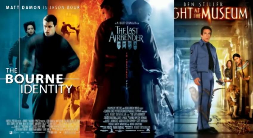
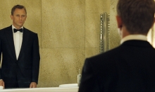
There's a science to these colors: Colors that sit across each other on the color wheel complement each other. For example, red and green, purple and yellow, orange and teal. Unfortunately, the color scheme for one too many generic posters are orange and blue. Think about it - G.I. Joe, Night at the Museum, John Carter, 127 Hours, The Bourne Identity.. are all mainly orange and teal.
2. Floating Heads

When a studio wants to show off its A-list stars, no matter what the backdrop is, they just fill it in with floating heads of the leading cast.
3. Writings Across The Face
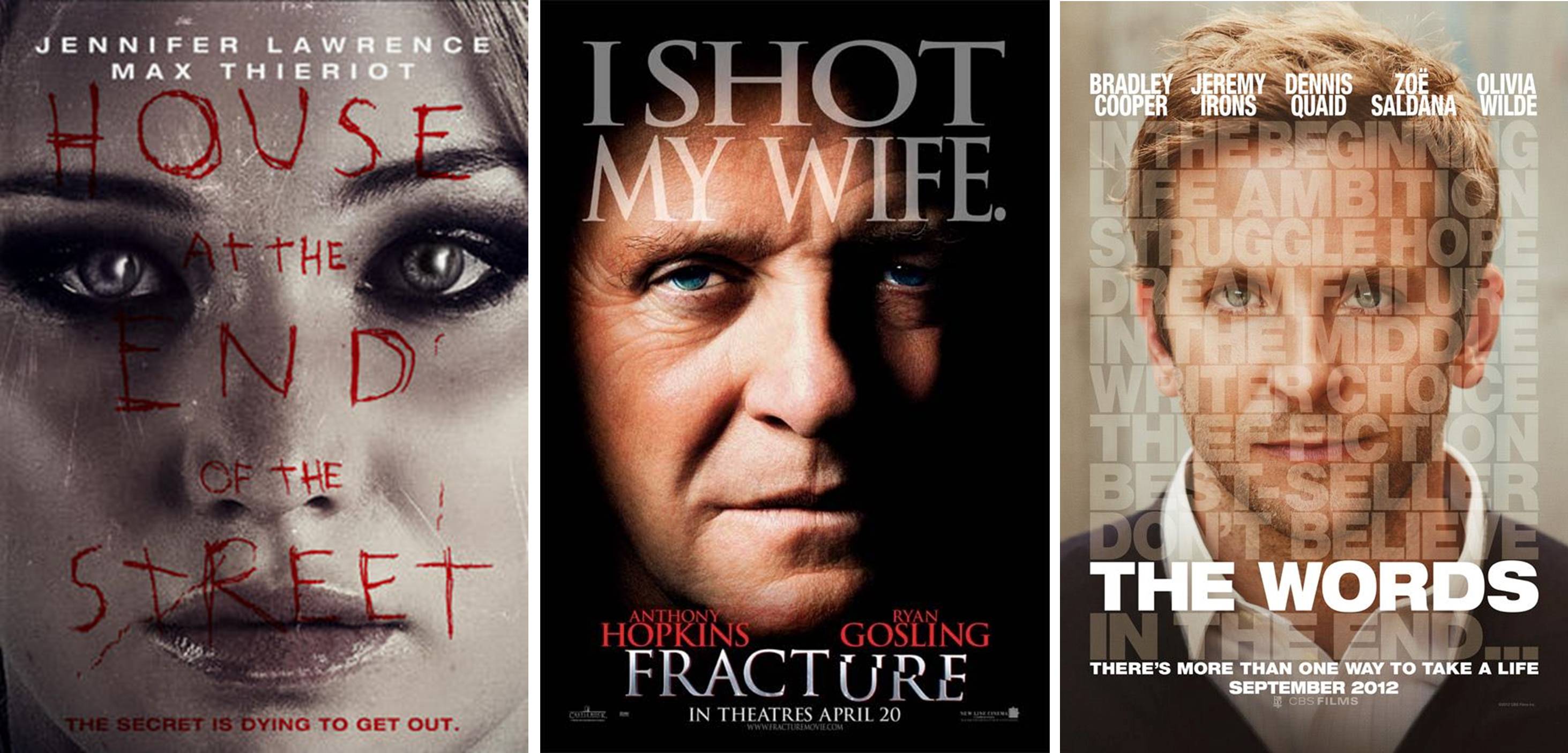
Like seriously, why?
4. Quirky Indie Movie Posters are Yellow
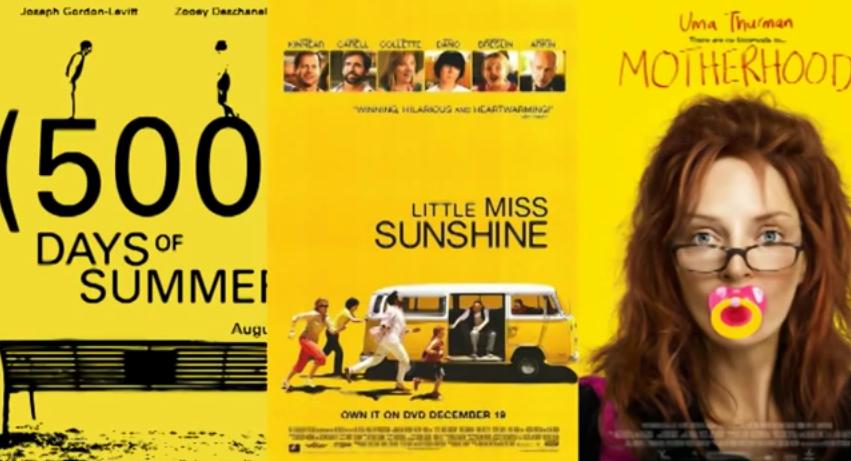
What's that supposed to mean?
5. Orange and White
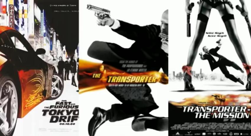
Again, orange is a popular choice, especially if you want to remind the audience to be prepared for some action, like the posters for Ghost Rider, The Fast and the Furious, and Bangkok Dangerous.
6. View From The Back
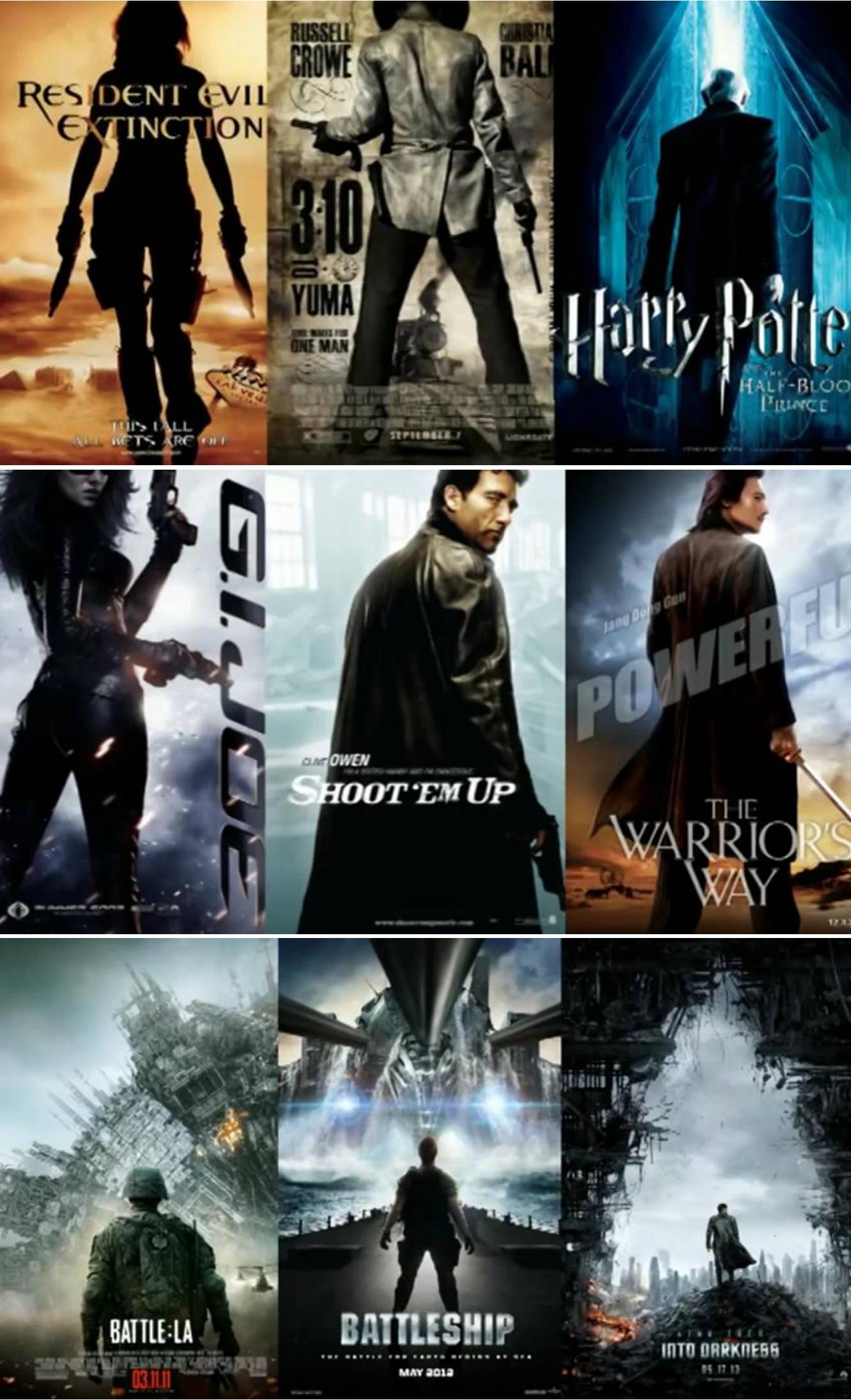
It's a guy standing strong in front of an apocalypse - often the hero or heroine, or a hero looking over his/her shoulder, carrying a weapon.
7. Do You Have an Eye for Horror? Because the Studios Sure Do
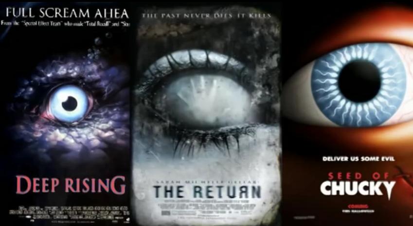
Looking into eyes can be creepy. But not many horror movies have anything to do with eyes - like The Skeleton Key. Or The Grudge 2.
8. Romantic Comedy Leads Standing Back to Back
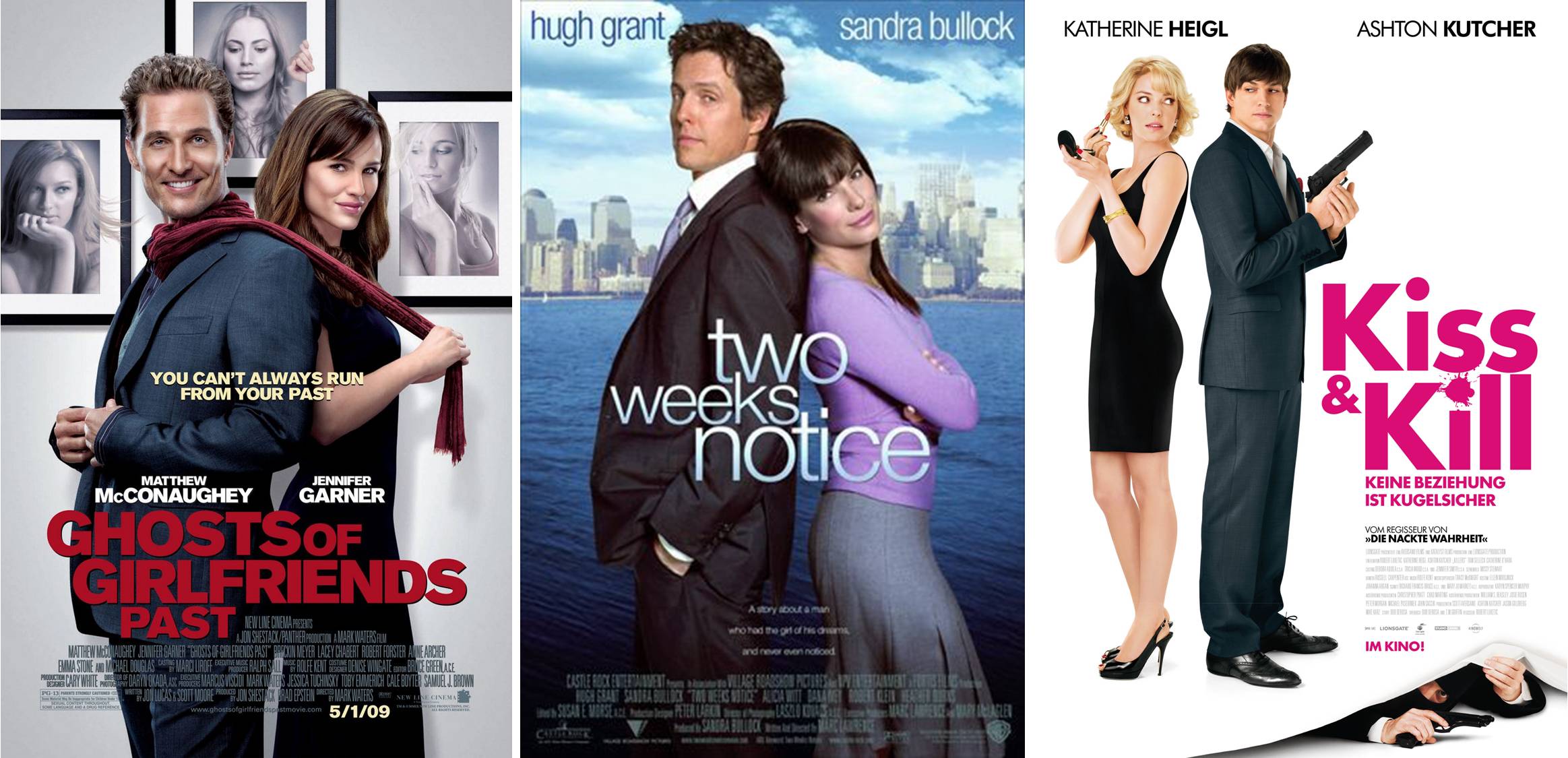
Because they're supposed to be unaware that they will fall in love in the movie, even though you know they'll end up being confused about their feelings midway, fall in love and realize they were 'made for each other' or are "the one" for each other. The posters are as cliché as the movie.
For a full lowdown on clichéd movie posters by Trachenberg, check out the video below: