


SeeMe: Where Fashion Becomes a Love Letter – The Arab Brand Turning Memory Into Style


Different Styles of Saree Draping - Beat the Heat in Style!

How to Pick the Perfect Anniversary Cake for Your Partner


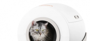
How to Maintain and Care for Your Self-Cleaning Cat Litter Box

Top 5 Mistakes to Avoid During Water Damage Clean Up

Top 5 Mistakes to Avoid During Water Damage Clean Up Jan 09, 2025

Ensuring Your Smile: The Importance of a Secure Dental Health Strategy


Nepalese Cliff Honey: Bounty of the Himalayas for the hunters

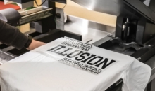
Lanyard Keychain: Perfect for Conference Networking and Identity


Eco-entrepreneurship: opportunities in the green economy


The Top Trends in Steam Baths and Showers Today

The Top Trends in Steam Baths and Showers Today Dec 18, 2024

The Role of Peptides in Reversing the Effects of Aging


How to Keep an Active Lifestyle for Seniors

How to Keep an Active Lifestyle for Seniors Dec 11, 2024
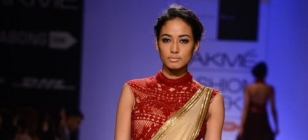
What to Expect Being a Bridesmaid in an Indian Wedding?

The Restaurant That Sued Its Customers: The Reputation Fallout from a Legal Battle Over Yelp Reviews

The Restaurant That Sued Its Customers: The Reputation Fallout from a Legal Battle Over Yelp Reviews Nov 29, 2024

The Ultimate Guide to Choosing the Best Blackout Roller Blind

How to Create an ATS-Friendly Resume Format?
May 23, 2023 00:43
Creating a resume that's ATS-friendly isn't that hard. It just requires some careful planning.
ATS-friendly formatting ensures your resume can get through to a hiring manager without being rejected by an applicant tracking system (ATS). Avoid unusual formattings like special graphics or images, as this can confuse the ATS.

Formatting
When it comes to formatting your resume, less is more. The goal of your format should be to create a clean, professional-looking document that is easy for employers to read. Avoid adjusting your margins to try and fit more information onto the page, as this can make it hard for hiring managers to discern what is most important.
The most traditional and widely-used resume format is the reverse chronological. This style begins with your most recent position at the top of the page and then walks backward through your career history. This format is best for job seekers who have a consistent career path and want to showcase their progression. However, the functional format may be a better choice if you have gaps in your employment or are looking to change careers.
Fonts
The fonts you choose can make a big impact on how your resume looks. When choosing a resume font, readability and clarity should be top priorities. Avoid casual fonts like Comic Sans or Papyrus, which can give off a childish vibe. Also, stay away from fonts that are polarizing or may inspire strong positive or negative emotions.
Consider a serif font, such as Garamond or Book Antiqua, for the body of your resume. These fonts have a classic look and feel familiar to reviewers, as they're often used in academic papers or publications.
A sans-serif font, such as Helvetica or Arial, works well for the headings and footers. These fonts are easy to read and look professional.
White Space
White space, or the areas on a resume without text, is important for making a resume look professional. You want to have enough white space so that it’s easy for recruiters to read your resume but not so much that it looks crowded or unorganized.
You should also make sure to use an easily readable font and avoid using bold or italicized text. This can make your resume difficult to read and may give the impression that you’re not professional.
Choosing the best resume format is essential for getting the job. There are many different formats to choose from, including chronological, functional, and combination. Each has its benefits, but you should choose the most relevant to your experience and industry.
Capitalization
When creating a resume, you want to be sure that all of the information is easy for the recruiter or hiring manager to read. One way to do this is by using proper capitalization.
Proper capitalization is important regarding job titles, company names, and dates of employment. Also, make sure to capitalize all important words in your description of work experience.
Using a professional font is another thing that can help your resume look more polished. Use Times New Roman or a similar serif font (fonts with tails) and keep the size at 14-16 points. Avoid fancy fonts, such as Curlz MT, or other fun fonts that could distract your reader. Remember that the recruiter or hiring manager is looking for information that will help them decide whether you are a good fit for their organization.

In a world flooded with fast fashion and trend-chasing designs, one Arab brand dares to slow down and look deeper — into memory, into meaning, and into the eyes of a mother.SeeMe, a luxury fashion and accessories brand based in Amman, Jordan, is not just another name in the fashion scene. It’s a personal, artistic journey born out of love, grief, and identity — a brand that literally sees you. Read more

Let’s get one thing straight—sarees are never going out of style. What does evolve, though? The drape. From grandmom-core to fashion-week realness, diff styles of saree draping are having a moment (again). Whether you're learning to pleat from YouTube or remixing the pallu with boots and a belt, this six-yard stunner continues to be the ultimate canvas of expression. Read more

Is your anniversary on the horizon? It’s undoubtedly a memorable occasion that you should celebrate grandly. You don’t always have to go the whole hog; sometimes a cute gesture such as flowers, a handwritten note, and even a delicious anniversary cake works wonders. But how do you choose the perfect cake to delight him/her on the big day? Here are some choices worth considering in this case. Read more
LIFESTYLE
Mar 19, 2025 21:34
Copyright © Fooyoh.com. All rights reserved. User Agreement | Privacy Policy | Contact us
| Advertising
| About us
| Careers