You've got to have Sherlock Holmes' observant eyes for this exercise. Google updated their logo over the weekend. Did you notice? It is very difficult to tell.
Here’s the updated version…
And here’s the previous one.
So what was the difference? Before looking at the answer below, try looking up again to see if you can spot the change.
Still can't? Scroll down..
Here it is:
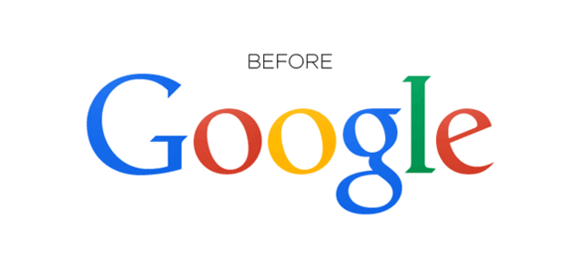
Someone must have been so glad they finally fixed that one pixel off in the G and L. [
Reddit]