


The Most Popular Words in Music Over the Last 50 Years Revealed
Mar 07, 2014 20:33
Ever notice how the same words tend to pop up in almost every song you listen to? Turns out that you're not the only one.
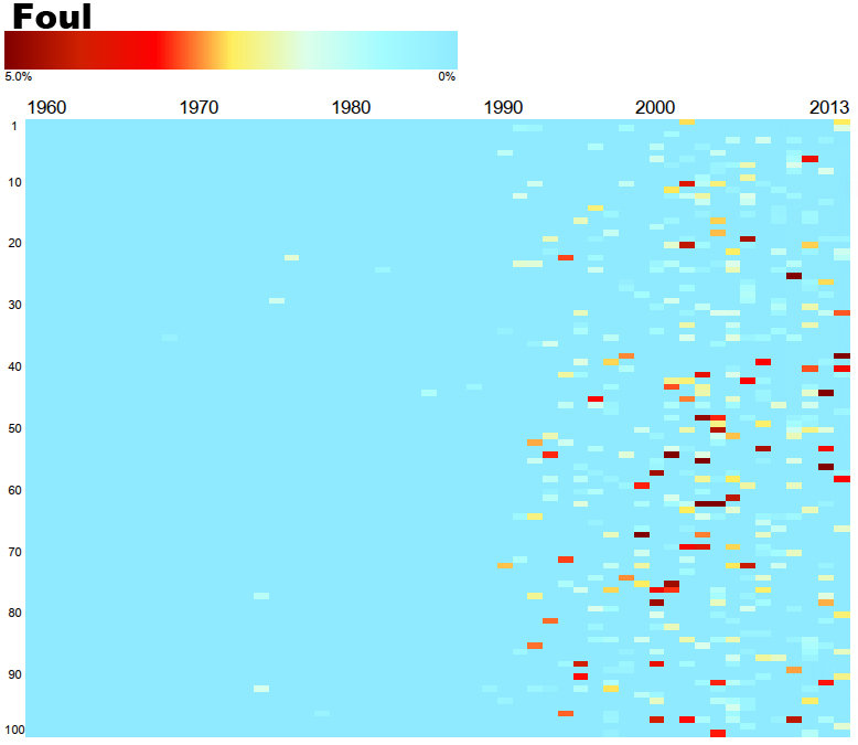
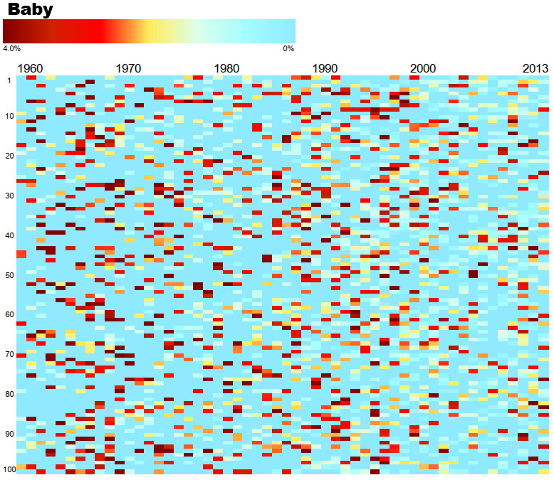
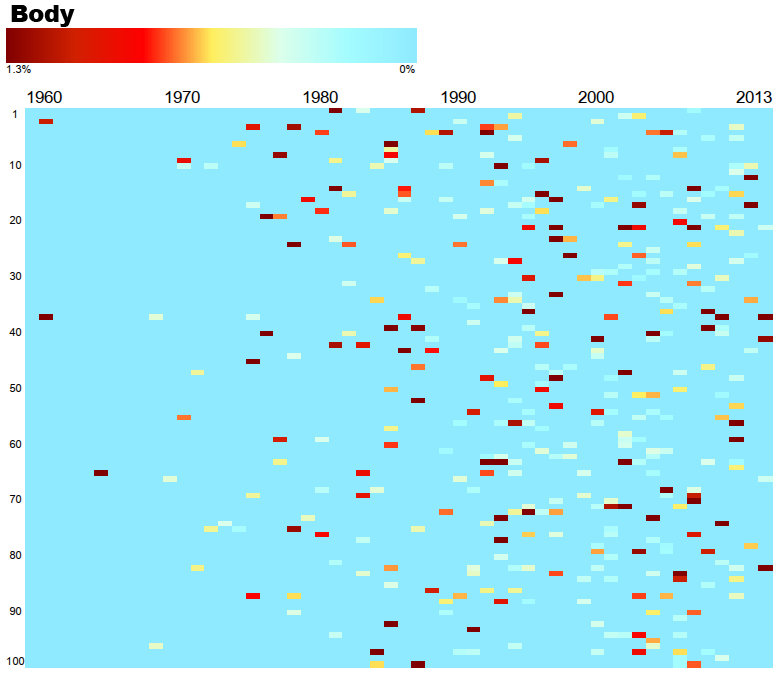
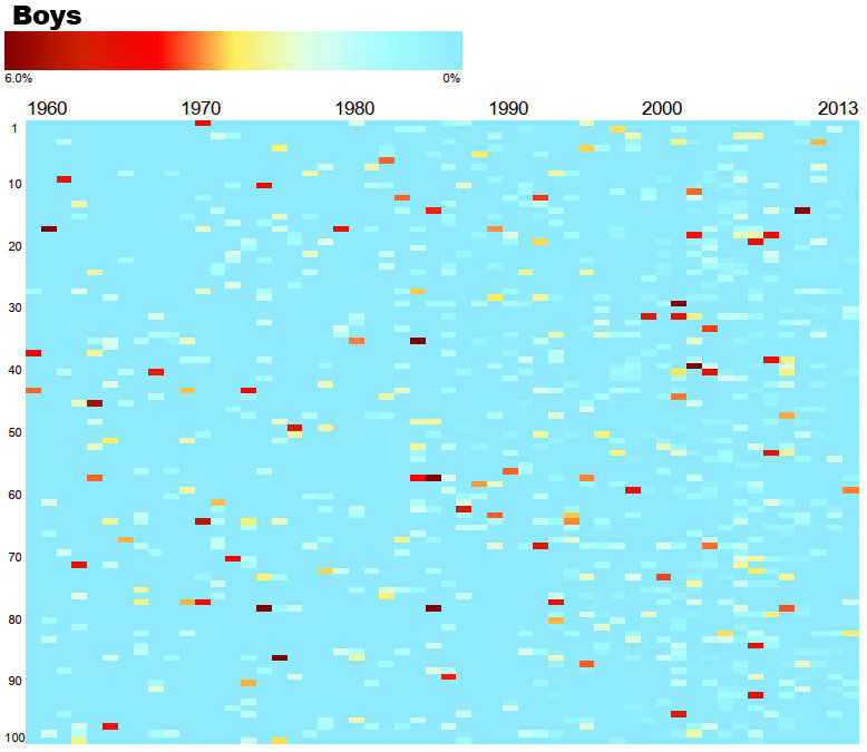
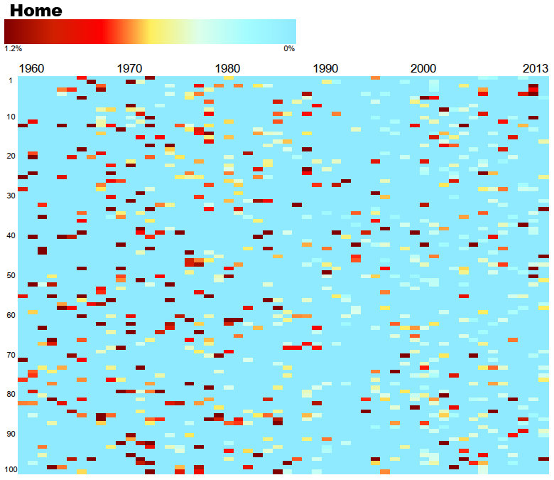
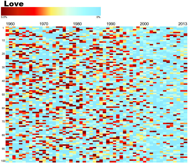
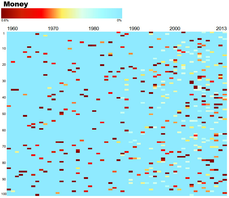
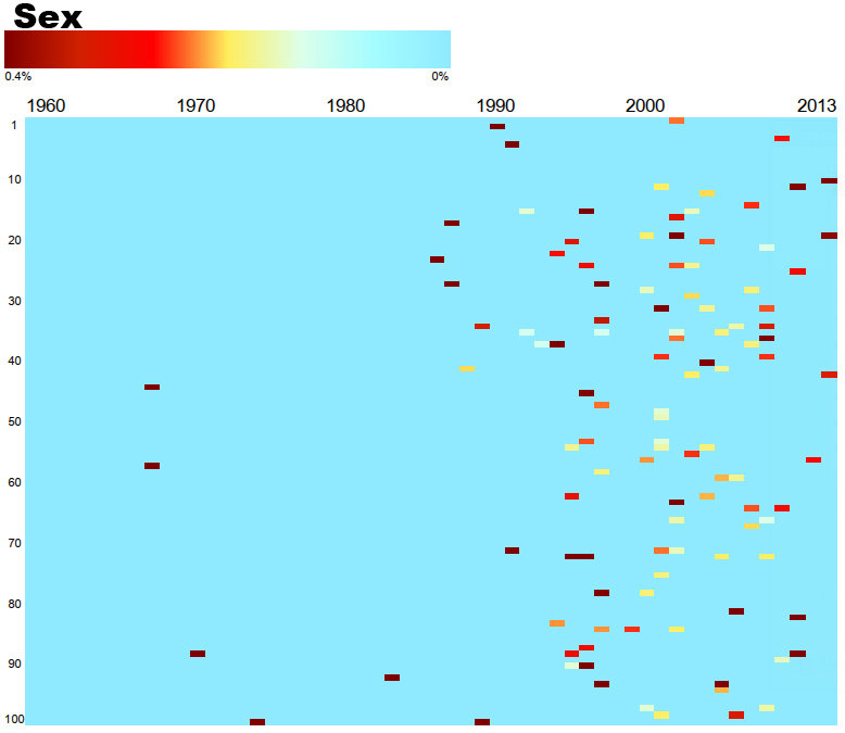
Based on the data of the songs on Billboard’s Year-End Hot 100 list since 1960 and compiled by Pittsburgh-based digital artist Nickolay Lamm created these these colorful graphs to reveal the popularity of certain words in the songs.
The horizontal axis represents the year and the y-axis represents the song’s popularity according to Billboard, while each rectangle represents a song. The darker the color of the cell, the more often the specific word appears in the song. Check out the results below:
- songs,
- words,
- lyrics,
- popularity,
- graph