


Will Bing's New Logo Make You Want To Use It?
Sep 18, 2013 01:44
Microsoft's Bing just got a makeover. They hope it's going to make people want to use the service. Will a change be enough?
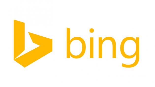
Using the same color as one of the Windows quadrants, a stylized "b" and a sharp Segoe font, the logo is more modern looking. According to Microsoft's design lead Lawrence Ripsher, "the logo, obviously, is a big deal for us, a lot more angular and fresh and sharper than we've used in the past."
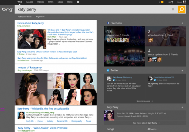
At least they've done a better job than Yahoo. Elsewhere, the entire search engine has been given a design overhaul too. Page Zero shows some search results before you've even finished typing, and Pole Position highlights specific results at the top of your search.
The changes are fairly subtle, but apparently Microsoft plans to roll out more radical results layouts soon, too.
Still, will it be enough to drive users away from Google? What do you think? [Bing via Verge]