Tips To Improve Your XR Design For Educational Purposes
Oct 26, 2022 23:35
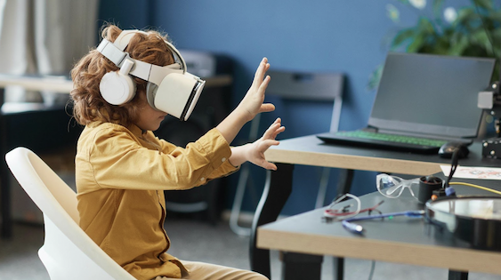
XR is already changing the way students attend their lectures.
Gone are the days when traditional methods were used to take the main seat and rule the classrooms.
This might still be the case in some, but the majority has already resorted to immersive technologies to enhance the way a student reads, writes, and attends lectures.

However, this doesn’t mean that all of this comes without any trouble or hurdle faced by educational experts.
There are still many areas where rigorous work is needed. And this is where our tips related to your XR design will help you arrange interactive study sessions.
So, let’s dive straight into the points you have been looking for.
Focus On Soft Colors And Engaging Colors
A ton of things change when it comes to educational purposes.
You are supposed to engage your audience in a different way than those binge-watching a movie or playing a game.
This simply means that your “engagement strategies”, when it comes to education and training, should enhance a person’s brain activity, focus, and above all, productivity.
There are a few useful ways for doing so.
And the first one includes focusing on soft colors instead of the other way around.
The reason is that, unlike playing a game, a student’s mind can easily get tired or lose focus or attention because of low interest in the subject in front of them.
Therefore, anything that causes a bit of trouble or hassle can result in disruption in study sessions. The same is the case when it comes to color combinations.
So, be mindful of those that make your XR design friendly to students and not the other way around.
The Imaging Should Be Interactive And Not Tiring
Coming onto the next part and keeping in line with enhancing a student’s focus, your XR design should focus on “less-tiring” imaging results.
This is also in connection with how you are supposed to improve virtual space for students in order to ensure long study sessions with uninterrupted focus and everything in between.
If your imaging is going to be energy-draining, the chances are students will soon start to lose their focus and get tired, ultimately choosing to move out of class instead of forcing themselves to do something not-so-doable.
Try Breaking Study Sessions
There are many designers who have encountered this problem: use of soft images still not results in long study sessions, what should we do?”
The answer to this is simple: keep your study sessions short but interactive.
This is another tactic to enhance productivity instead of making students feel tired and heavy about the virtual spaces they are in.
Make Complete Use Of Virtual Motions
Since our whole talk is based on improving XR design for enhanced study sessions, leaving the “virtual motion” part behind would be too naïve.
This means that many students find it hard to easily interact within their virtual class or space. So, in order to solve this issue, make use of in-app virtual motions that perfectly align with their body movements.
Bottom Line:
As exciting as it may sound, XR design tricks and everything related to it come with a certain set of challenges and hurdles. This is especially the case when it comes to designing a product for educational needs.
You are supposed to take care of many things at the same time because your targeted audience is not here just for fun but for concentrating and enhancing productivity.
With that said, if you found these tips useful for your upcoming XR design, do let us know!


